Quantifying infants’ everyday experiences with objects in a large corpus of egocentric videos
What shapes how young children come to understand the world of objects around them? While we know that infants develop remarkable categorization abilities within their first year, the puzzle of how this learning unfolds in real-world environments remains largely unexplored. Consider the gap between laboratory findings and everyday experience: controlled studies reveal emerging categorization skills, yet we have limited insight into the actual visual landscape that drives this learning.
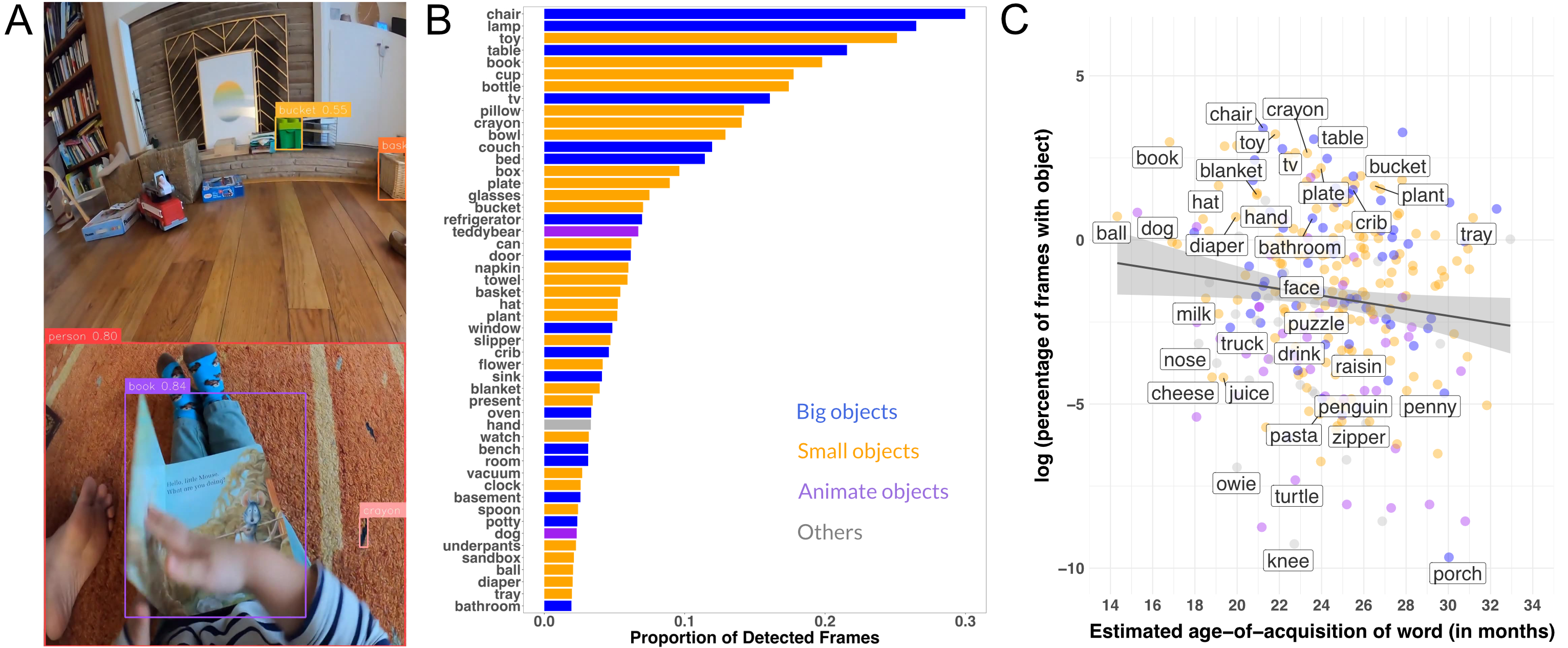
This project addresses these questions by investigating how infants learn to categorize objects through analysis of their real-world visual experiences. The study overcomes the previous limitations of the reliance on manual data annotations and the absence of at-home data by applying state-of-the-art computer vision techniques to detect objects in the Babyview Dataset.
The analyses of infants’ visual experiences reveal patterns that may help explain the remarkable efficiency of early learning. By documenting the actual frequency, variety, and contextual richness of object encounters in daily life, this work provides crucial empirical grounding for understanding how children acquire categorical knowledge so effectively. Understanding how infants’ everyday visual experiences support such efficient category formation could reshape our approach to both developmental theory and artificial intelligence, revealing principles that bridge the gap between human and machine learning capabilities.

You can also put regular text between your rows of images, even citations (missing reference). Say you wanted to write a bit about your project before you posted the rest of the images. You describe how you toiled, sweated, bled for your project, and then… you reveal its glory in the next row of images.


The code is simple. Just wrap your images with <div class="col-sm"> and place them inside <div class="row"> (read more about the Bootstrap Grid system). To make images responsive, add img-fluid class to each; for rounded corners and shadows use rounded and z-depth-1 classes. Here’s the code for the last row of images above:
<div class="row justify-content-sm-center">
  <div class="col-sm-8 mt-3 mt-md-0">
    {% include figure.liquid path="assets/img/6.jpg" title="example image" class="img-fluid rounded z-depth-1" %}
  </div>
  <div class="col-sm-4 mt-3 mt-md-0">
    {% include figure.liquid path="assets/img/11.jpg" title="example image" class="img-fluid rounded z-depth-1" %}
  </div>
</div>